Hello there!
And welcome to Volume 9, Your Comments on the Cover for Becoming Amber
This is the ninth in a series about the state of fiction writing today along with updates on my debut novel, Becoming Amber, which will be released later this year.
To read past newsletters, go here. To sign up for future newsletters, go here.
Thank you for the votes and comments about which cover you preferred for Book One in The Amber Saga, Becoming Amber.
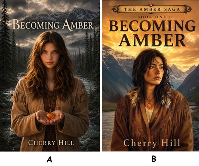
Cover A was the rough draft I sent to the publisher to give them an idea of what I had in mind. They also asked me to provide a description of important features that should be included on the cover and the mood that I hope the cover will convey.
As soon as I sent them my draft, I realized it looked more spooky and even like a teen vampire story so I asked them to modify mine and to send me their ideas.
Cover B was among three fresh takes they sent me and it caught me right away, although there were a half dozen things I asked the art director to fix. That took a few weeks back and forth to get to cover B as it is today and which is the final cover.
Still, I wanted to hear your opinion because there is a long line of covers in my future and I already have designed my version of the cover for Book 2 in the series.
So after looking through all your comments, I counted the votes.
The verdict is in!
The favorite cover for Becoming Amber is!
Cover B - 53%
Cover A - 31%
Both Covers (couldn't decide) - 16%
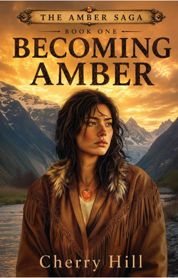
Here are some of your comments about Cover B:
New book cover is right on! Girl does not look so innocent and meek. New one looks like she can face anything and give it her best shot without a doubt. Eggggcellent!
I do LOVE the new amber color and the fact that Amber is not as pristine as in your first cover. She now Looks more like someone living in Bush Country!
I love the current cover. The artist captured toughness, determination, and beauty in the protagonist. There is a sense of impeding adventure with her glance to the side; as if Amber is considering how she will handle the next challenge that comes her way! And of course the lovely wilderness setting.
I like the second pic. Although I don't know the story line, I know it is in Alaska. Her eyes tell an unknown story, her imperfect hair is perfect and the background is amazing. Looking forward to reading the book!!
I like that you’re saying this is a series, ie a story to get invested in.
“A” is very dark and simple, and to me, uninviting. “B” has layers upon layers, and Amber’s face hints at depth & experiences, while “A” is simplistically pretty.
B ... she looks worried yet determined. And I like her jacket better.
B. The background color, title font and border, her facial expression, coat, and amber sunrise fit the story line. A. Uninviting to me. Dark and foreboding skyline. Is she giving her heart away to an unearthly creature of the night? Possibly another vampire series? I would pick up cover B and read the forward out of curiosity. I would pass on book A.
Her eyes and facial expression lead you to want to know more.
In B she looks “real”. Not someone who does her hair and make up on the daily.
First picture looks like a perfect girl. Second one shows distraught and a woman who is going through … what? I want to read the story.
Left sort of sad and dark right -mysterious and awakening.
B ... She has a sultry look and on a quest ... for something ...
I like the B. Looks more real, more intriguing. I most always lean toward the one I relate to. Am super excited to begin the series.
B , I want to know what caused this look.
Humm. I like A but I'm drawn to B?
B is suggestive that this will be a tale of a woman who has endured and is prepared to overcome intriguing challenges. Also the coloring befits a mood of mystery and it is clear that this is the first of more to come.
B light sky in contrast to dark ground.
B Amber is more mature in this photo. She is not perceived as a teen book. But what I really love are the words above! The Amber Saga and of course Book One. It already tells me, there is so much more to come!
B. I can not wait … I like B. The hair looks real and her expression makes me think she has had some unusual past along with the over sized coat but I think her lips are to big. The background showing perhaps a brighter day ahead.
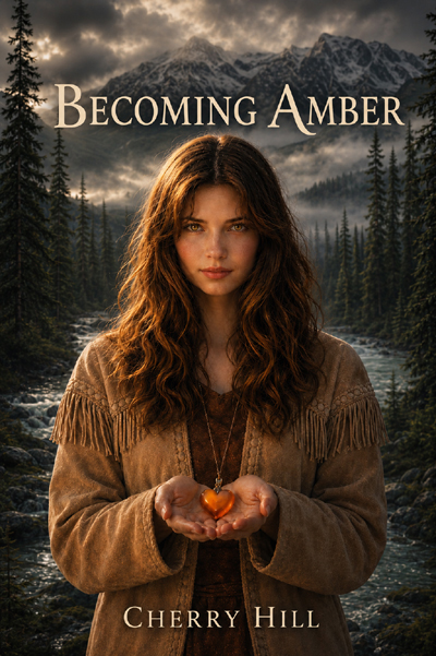
Here are some of your comments about Cover A:
I like the first one with her holding the necklace the look on her face looked mysterious like a secret to tell.
From a man’s perspective, if the purpose of a book’s cover is to pique my interest, A does that much better than B.
A - I love her calm and inviting look. I am looking forward to finding out her story!
I like A better. I don’t know what the story is about, but B looks like she’s really had a rough life. A portrays her as calm and serene.
A where she is holding the amber heart; it conveys she is protective of her feelings and looks for honesty and truth.
A has an inviting mystical feel to it. B looks like a character with with baggage. I would probably feel more compelled to pick up a book with cover A, as I typically want to read a book that I can escape into, not one I'm likely to relate to.
A but that's my style.
A is more inviting than B because of captivating stare.
No clue what this about, but A looks a bit hopeful and seeking positive approval. B seems somewhat defeated or displeased with something or someone.
I prefer cover A, because the girl looks stronger and more optimistic. She looks defeated in the other one!
Here are the comments from those of you who couldn't choose:
Both great covers. Would read them both. Congratulations
I'm first drawn to A as she looks like she's been able to smartly work through and perhaps manipulate in a way to be where she ends up. B looks like she's had to struggle and fight through to get where she is which makes it intriguing. This is a tough decision. I may be leaning slightly toward A - but I like them both!
One on the front cover and the other on the back ... kind of like a participation ribbon ...
Not knowing the plot of this book series, I’m intuiting that B looks like the cover of the first book in the series and A looks like heroine in the last book in the series.
Depends. Going for a teenager young adult demographic, A. Going for a middle ager, more substance oriented, B. A has the Charmed witchcraft feel , B has the hope isn't a feather it's grit as she rises up for another go.
Each one leads to believing a different version of Amber.
Both are beautifully done. If a younger woman starting a saga I would choose A. As she matures throughout the series B.
I can't decide I like both book covers
First picture looks like a
perfect girl. Second one shows distraught and a woman who is going through …
what? I want to read the story.
Thanks for all the GREAT comments!!
See my next newsletter for the role of the Copy Editors along with updates on my debut novel, Becoming Amber.
Past newsletters cover the love of writing, the importance of a good idea, writing the book, looking for a publisher, the Acquisitions Editor, contract terms, the Developmental Editor, and cover design.
Until
then,